Lesson 8. Touch Ups: Ensure Efficacy, Viability, and Accessibility in Your Content

Michael Sheyahshe, an artist, author, developer, and technologist at alterNative Media, presents a whole series of 10 lessons on making e‑Learning cool: “How To Create Great e-Learning Content From A To Z.”
If you’re new to this series, it’s better to start from the first lesson.
In this lesson, we’ll look at ways we can polish up what we’ve previously done. Let’s focus on accessibility requirements and find out what it takes to boost PPT and audio/video files’ accessibility, how to make your content mobile ready, and what tools to use.
Watch the recording or skip to the article if you prefer reading.
Accessibility requirements for e-Learning
When talking about accessibility, there are 2 standards to consider: Section 508 and WCAG 2.0 (Web Content Accessibility Guidelines). Until recently, S508, a US federal government standard, was less stringent than WCAG 2.0. Since S508 received a major update, these two standards have become more or less equal.
The World Wide Web Consortium distinguishes three levels of WCAG accessibility: A, AA and AAA. Usually, what we aim for is the AA standard, to make sure the content is consumable, operable in general, and adapted for those who are visually or hearing impaired. Here you can find out how to meet WCAG 2.0 requirements.
PPT Accessibility
It’s very convenient to prepare slides for your courses in PPT, since Microsoft itself offers ways to make your PowerPoint accessible for stakeholders, SMEs or learners. You can use alt text and built-in layouts for images. Make sure you adjust the tabbing or screen reading order in the selection pane. Double-check your links for meaningful text or correct HTTP addresses and see if your font is large enough and readable. It’s vital to pay attention to colors, slide structure (header, body text of a slide), built-in tables, attached videos, etc. Follow the link to see more Microsoft tips.
How to Check Accessibility Automatically
Microsoft also provides an Accessibility checker, which is built into PowerPoint.
Just click File → Info and select the Check for Issues button. In the drop-down list, select Check Accessibility.
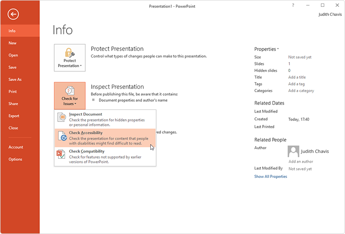
If you use Office 365, checking accessibility is a few steps shorter. Simply go to the Review tab:

There are also a number of external tools for checking accessibility: for instance, Achecker, FAE (Functional Accessibility Evaluator), and WebAIM Color Contrast Checker. Some of them can be are just add-ins for Chrome or Mozilla Firefox. These are very robust tools that will allow you to see what’s under the hood of HTML5 and other content solutions. They also provide great results; namely, your content gets better and you see how to develop it further.
Accessible Text
When it comes to accessible on-screen text, we need to comply with the WCAG 2.0 color contrast ratio. An accessible text has to have a ratio of 4.5:1 for a normal text (ca.14 point) and 3:1 for a “large text” (18 point). A color contrast checker helps to define whether your text is viewable and “consumable” on the screen.
Accessible Video
Closed and open captions, subtitles and descriptions are accessibility features that make video available for people who need a transcript of spoken text. It’s also a way to include some non-speech elements which are important for representation of a concept or idea. Let’s focus today on closed captions (CC), which can be turned off/on, if desired.
Video Captions in iSpring Suite
How can you make a video more accessible inside PowerPoint with iSpring? Here’s one way to make sure closed captions work in the iSpring player. You can do it with the help of HTML5 using the iSpring Web Object feature. Create an HTML file in any HTML editor. This file should include the video tag for the video you would like to attach () and a track. Here you can find more information about HTML files.
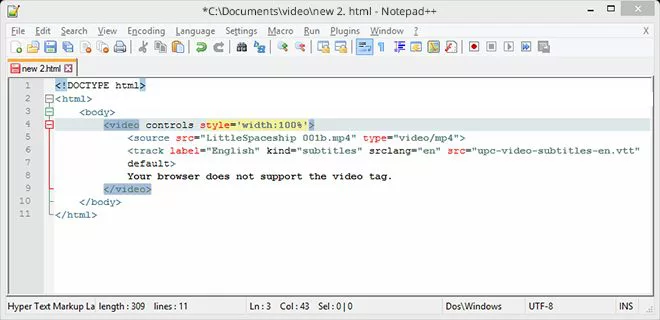
The track is especially important, since it handles the closed captions and redirects you to a WebVTT (Web Video Text Track) file. It implies the presence of a WebVTT file, which is a text-only file with timelines where you put your caption text that comes up on the screen. For example, HTML5 Video Caption Maker, which will help you to create .VVT files and timelines. Now, do as follows to attach your video with closed captions to the PowerPoint slide:
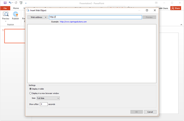
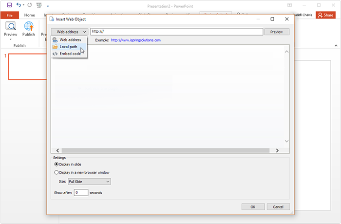
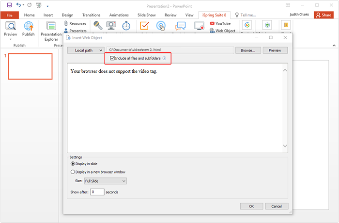
- Insert the iSpring Web object on the slide: iSpring Suite → Web Object.

- Choose a Local path.

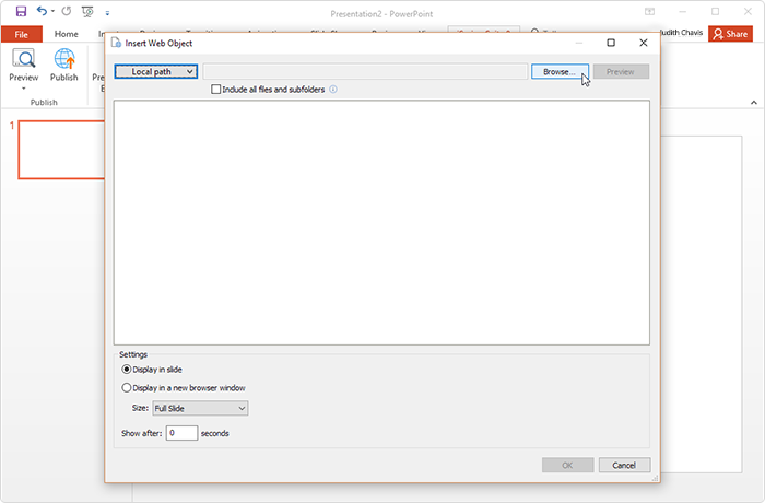
- Browse to the folder with your video, HTML file, and VVT.

- Make sure you check Include all files and subfolders. Choose one of the options: Display in slide or Display in a new browser window, then click OK.

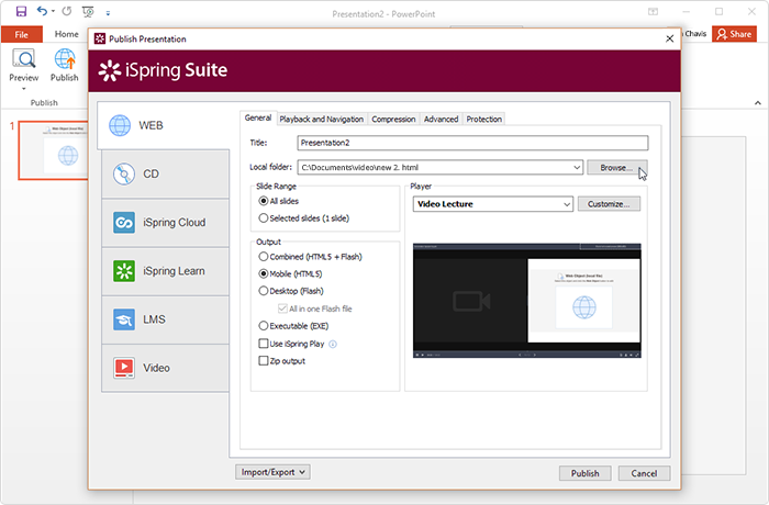
- Publish your video with added CC to the desired location.
 >
>
When previewing, be aware that some browsers don’t support HTML videos and closed captions, though they usually do.
How to Make Your Content Mobile Ready
This is a throwback to Lesson 4, when we discussed considerations for different mobile devices that we need to take into account when adding audio or video files. The iOS functions are slightly different from Android or Windows Phone. For instance, in some cases, devices don’t have an auto start, feature, even if you set video/audio to be played automatically when opening a slide. Make sure you test your content over and over again on each type of device as you publish.
As far as mobile readiness is concerned, you’d better think about how extensive the content you’re providing is, and is it compressed to the level that learners can consume. Think over which links, buttons, or sensor areas will be used on different mobile devices.
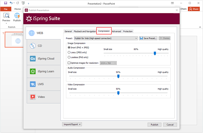
There are some ways to make sure your file size in iSpring is optimized. Check the iSpring Publish settings on the Compression tab. You can choose presets that adjust files for various levels of image, audio and video compression. That helps not only to optimize files, but also to find the balance between file size and quality.
The size of links and buttons actually matters when a learner is on a mobile device tapping with a finger. Ensure that all controls are big enough. Don’t use something that’s rollover only and enables learners to select on mobile devices.
Summing up the results, we realize that we’ve done a lot to make our content great for learners. We’ve looked at ways not only to make it accessible, perceivable, and consumable, but we’ve also tested the content on each device type to understand what our learners are going to experience.
Next time, Michael tells us how to publish and share ready-made content. Stay tuned!
Like this lesson or have any feedback? Please share with us in the comments below!

 >
>